Finding Ourselves with Aaron Draplin

Recently I was inspired by the amazing art teacher Don Masse who is always working with contemporary artists. You can learn more about his awesomeness at http://www.shinebritezamorano.com.
I have been wanting to do a project that focused more on graphic designers so I could introduce my students to this possible career choice in the arts. Don Masse did a project with the graphic designer Aaron Draplin so of course I had to check this guy out. First of all I loved how he is from Michigan and went to the Arts Institute in the Twin Cities. My students are familiar with these places so it made Draplin even more interesting. I also love how he goes around giving inspirational speeches and is the founder of Field Notes. I think by sharing all the different facets kids can see that art careers can come in many different forms.
For the first part of this project students had to create a logo that represented them. We started by writing some things down that describe ourselves. Then from there we drew images to represent the things that represent us. Finally we combined all the drawing into one logo. We began this process by watching this video of Aaron Draplin:

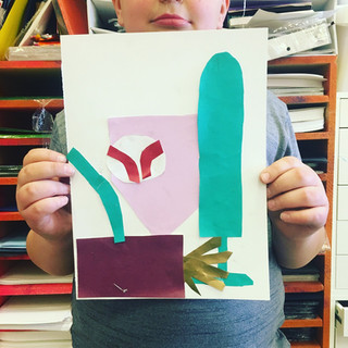
Once students finished their sketches we used Pacon Fadeless Designer paper to college their logo design on 9X12 white drawing paper. One thing I did discover is that because the designer paper is thinner students were much more successful using glue sticks rather then glue bottles. I also had the students draw their design on the back of the paper to avoid any pencil lines. Many of the kids loved their logo design so much that I put them through a color scanner and printed off colored images for them to print on so they could keep the original collage.

Once students finished their collage I had them use the iPads in my classroom to take a selfie. I took some time to teach kids how to take a good selfie, which I think they got a kick out of. I also told students that for this project you want to fill the frame up with as much of your face as you can. I then printed all of the pictures out on 9X12 printing paper. Students taped a piece of transparency film over their image and then a piece of drawing paper over the top of that(students used a piece of masking tape to tape all three pieces together at the top). I had students practice creating their outline with expo markers on the transparency film using their image to trace(which was underneath the film). Once they were happy they then used black premium crayola tempera paint. Students painted directly onto the transparency film then folded the paper over the top and pressed to create a mono print. Students would just paint one section at a time and print so the paint did not get too dry. I had students practice on drawing paper a few times to get comfortable with the technique. I also allowed students to be as detailed or as minimal as they wanted with their portriat. To clean the laminate I just had them use a wet paper towel to wipe of the paint. I also told student they could leave the paint on to dry and that each time they printed it would become a little more abstract. Many of the students really enjoyed the process but some students struggled with the medium because it was harder to control the thickness and thinn
est of the lines. For this project some students really struggled with the lack of control they could have over the printing process. I tried to share that sometimes that can be the best part to let the medium take control and see what happens. To find joy in the process and learn to admire the outcome. Through this process we also talked about facial portion so students can begin to understand them for when we move on to drawing portraits.
When students felt comfortable I then let them move on to the printed version of their logo design to do a final project.


The final product from this project was amazing and I truly love all the creative challenges the kids had to solve. I am so excited about this new printimaking technique I am hoping to try this project again but possibly use a digital format to create the logo and maybe another project introducing students to Jean Michel Basquiat. Students loved this printmaking process because it allowed them to be super successful in creating a self-portrait. I can't wait to dive into this more next year.


